Elaine Sturtevant – Peinture à Haute Tension (Martial Raysse), 1970 – While researching appropriation artists I came across this piece by Sturtevant and was immediately struck by the colours in this piece and they really jump off the image. They’re also incredibly contrasting to the simplicity of the image itself which is something I definitely wanted to come across in my own image. I couldn’t find whether this had an original image that Sturtevant had altered with these colours but it gave me the idea to add new colours to an existing image to give it new meaning.
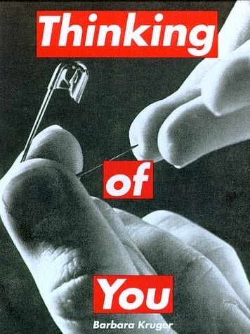
Barbara Kruger – During one of our workshops we were shown a number of images by appropriation artists including a couple of pieces by Barbara Kruger. I really liked what Kruger had done to these relatively normal images just by adding some bold text. This text would usually completely change the meaning of the image, much like the piece I found on the left which turned an image of someone pricking their finger into a picture about self-harm just by adding three words. Also by putting the text over a bold red background, it gives the image a sense of danger and urgency while also drawing your eyes towards it.
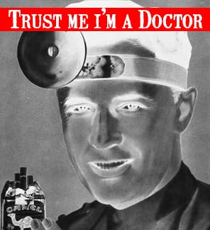
Because of the inspiration from Barbara Kruger I decided I wanted to try and follow her style and try and make an image that really changes it’s meaning through appropriation. My first step was to find an image I wanted to alter and from our first lecture where we were shown the work of Richard Prince, I knew that old cigarette advertisements were a good place to look. So I looked around and found this image which I really liked because of the clear image of the man’s face and I thought it was really ironic that it was an image of a doctor trying to endorse cigarettes.
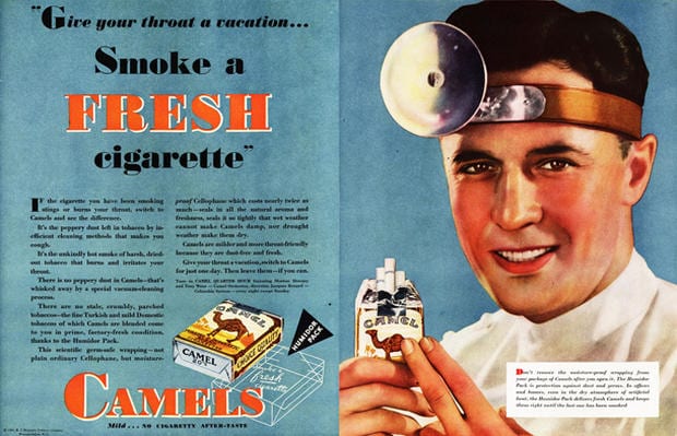
From that original image I altered it to create this piece. This piece is definitely inspired by Kruger’s work and started when I knew I wanted the image to have an incredibly creepy feeling to it. To get this I was experimenting with Photoshop and decided to invert the piece and then make it black and white which gave it this eerie feel with the doctor’s clothes becoming black as well as his teeth. Before that though I cropped the image to remove all the text on the other side and just leave his face. I knew this piece needed a phrase that would really push it to another level and really alter its meaning so I then decided on the phrase “Trust me I’m a doctor” because it’s a phrase that usually gives people a feeling of comfort and safety but with this image it’s meaning is tinged when paired with the disturbing image of the doctor holding the cigarettes.
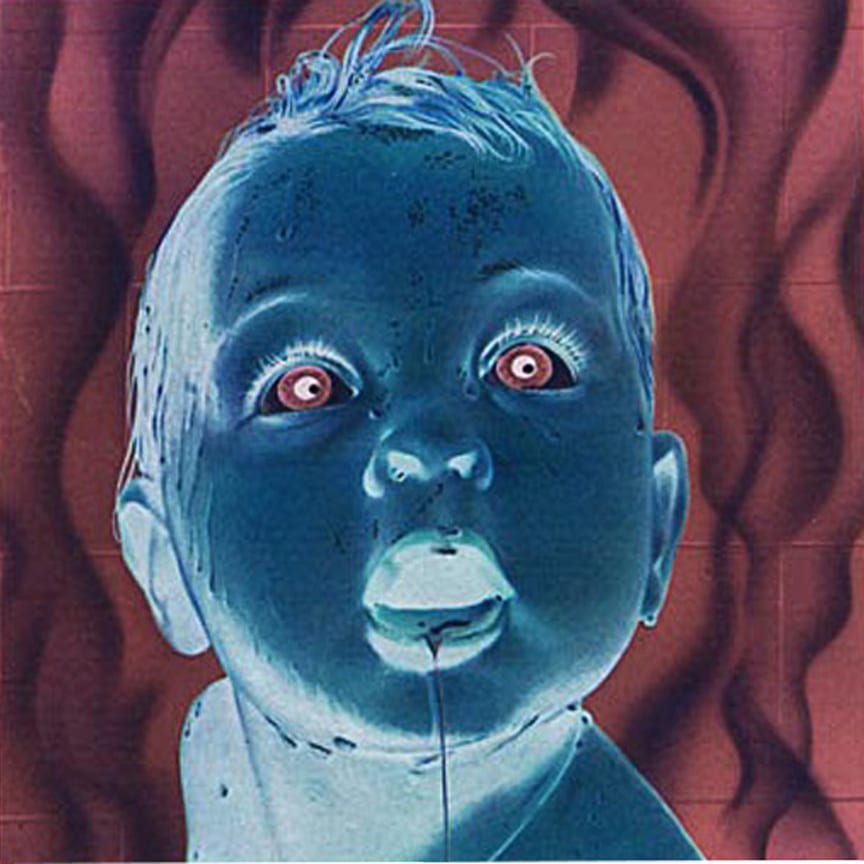
After experimenting with effects in my other piece and seeing the effect it can give, I knew this was something I wanted to carry on with. So from the other piece I knew I really liked the look of these vintage advertisements and the way they are painted. I looked for some more of these advertisements and came across this one advertising soap. I loved the image of the baby on the front and the way it could itself be a stand-alone image.

Again like the previous piece I’ve started by cropping out all the text and just leaving the image of the baby. I found the image itself to be quite unnerving on its own with the idea of a baby just staring up at you but I wanted to take the freakiness of it up a bit more. So again I experimented with some effects but none of them had the right effect really until I just decided to invert the image and suddenly I was left with this incredible blue shade to the baby’s skin. On top of that it made the eyes red and the mouth white which made the baby look almost demonic. The background also turned into this amazing red with these ripples in it, almost like fire.